

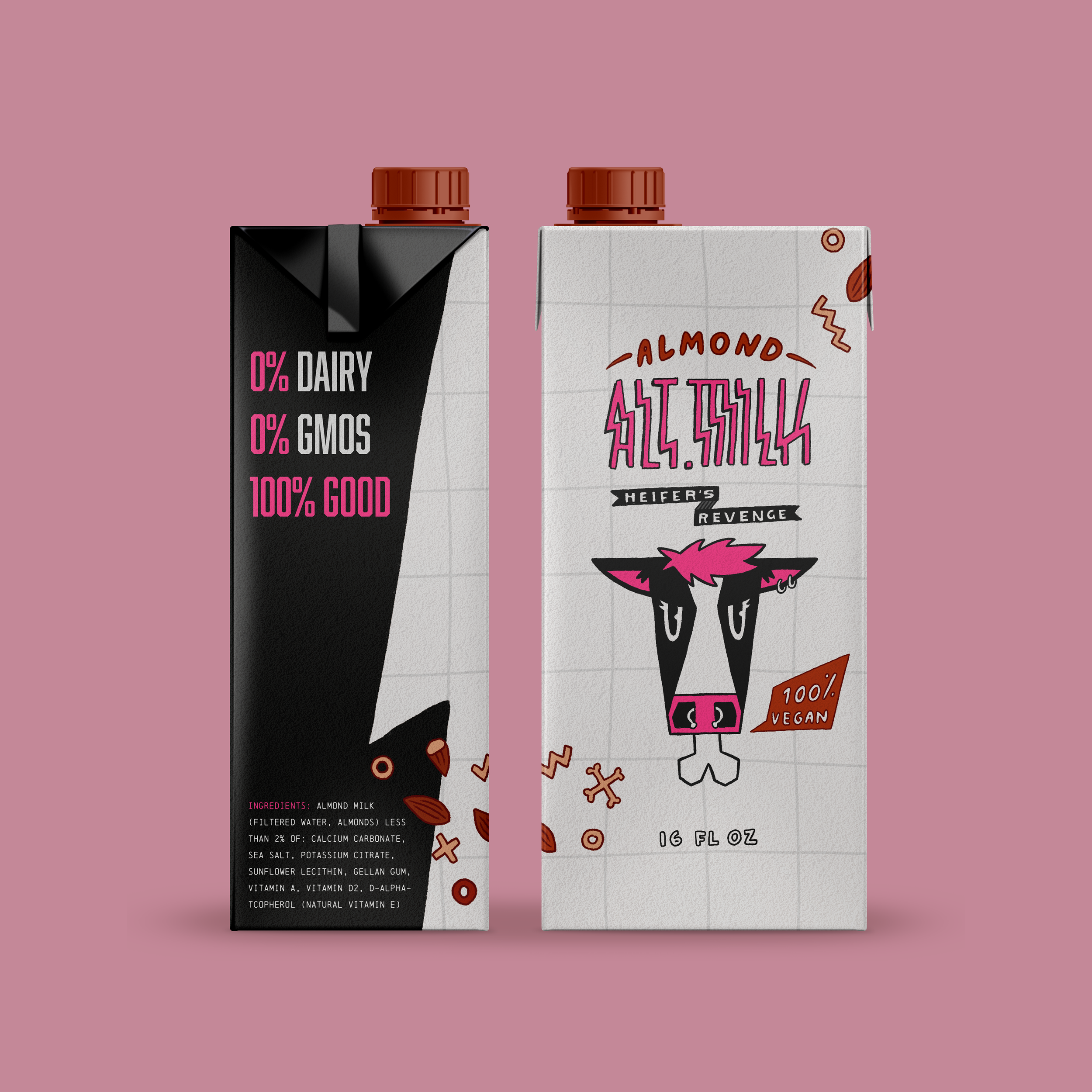
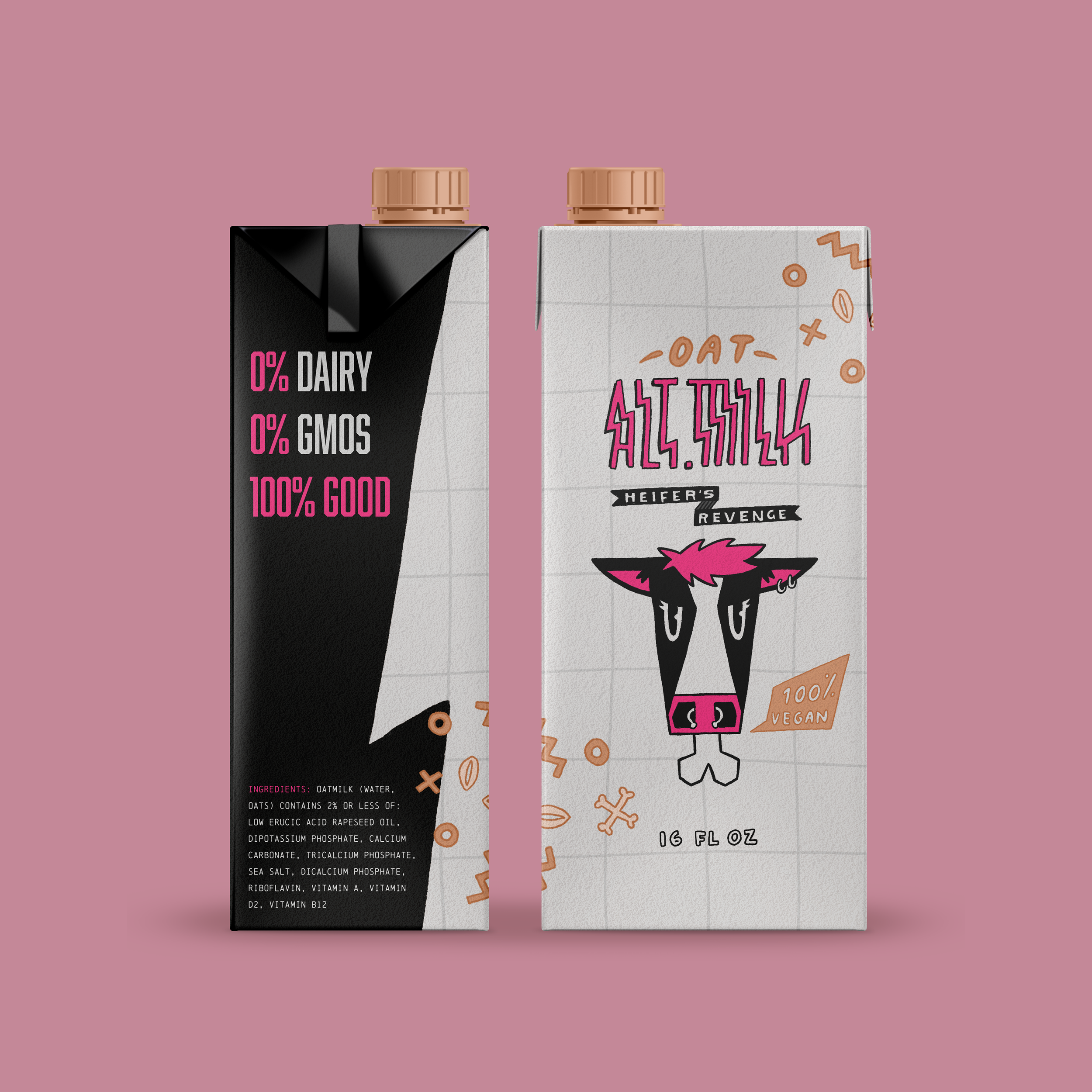
Alt.Milk
Alt.Milk is a new milk brand aiming to capture the attention of Gen Z’s ‘social media savvy teens.’ Inspired by the resurgence of the ‘alt’ aesthetic, the branding incorporates electric colors and illustrations which express both the cute and edgy styles that are staples in the aesthetic. The copy adds to this with the tagline ‘Heifer’s Revenge.’
ART DIRECTION - Caleb Heisey
INSTITUTION - Tyler School of Art and Architecture, Temple University
c. 2021
BRANDING
ILLUSTRATION
PACKAGING
Branding to an Audience
Social media savvy teens are constantly consuming media. Teens in general spend more than 7 hours a day on social media alone. They have a short attention span and consume so much, they know what they like and can filter through visual media super quickly. Because of this, studies have shown you have about 2 seconds to grab their attention.
To create a brand teens would like I had to learn more about them. Teens like brand personality and uniqueness, but in a way they can trust. They don’t want performative personality or off-brand quirkiness and can spot the fake easily. They like their marketing to lean towards on-brand and timely social conversation. Most notably, teens want authenticity. They want their brands to be real and in-tune with modern meme and slang culture.

Aesthetic & Authenticity
Alt is widely known as the group that helped grow tik-tok to popularity. The aesthetic of this group is rooted in the emo/scene look of the 2000’s, but has a modern spin that adjusts it towards internet culture. As described by Urban Dictionary, members of the alt aesthetic group are characterized as teenage girls who have dyed hair, wear thrifted clothes, and listen to alternative music. Staples in the culture are the colors pink, black, and white, cute cartoon characters, and gothic dress and makeup.


Brand Identity
NAMING
Duality is a big part of Alt culture. Subverting the cute and girly with edgy and hard. The name Alt.Milk doubles as a description of the product and a callout to the alt group. The period between the two words act as a punctuation to let you know the word is shortened but it also references internet culture similar to the dot after www.
LOOK & FEEL
It was important to try and keep the brand as authentic to the alternative aesthetic as possible so I kept with the main colors of pink, white, and a dark grey. I also went with hand drawn type, logo, and pattern because it doesn’t get more authentic then that. The ‘heifer’ logomark is an element of the brand similar to how Chick-fil-a uses its cow to promote utilization of alternative cow products. The heifer is upset she was killed so she’s on a mission to avenge her kind by being an example of what you’re avoiding by using Alt.Milk. This was one way to bring a little more edge to the brand.


Packaging
Because of the decision to have a cow as the mascot for the brand, it was important that the package let the consumer know that this is not a dairy product. I chose the less traditional box milk package to ensure this and create less confusion. I also utilized bones and other elements in a pattern on the packaging to draw attention to the ingredients the milk is made of.