
Ship *under construction*
Because of the COVID-19 pandemic many individuals needed a new way to socialize and experience foods. SHIP is an app which merges dating, travel, and authentic cuisine by helping you connect to new matches and explore new countries right from your phone. With SHIP, the world is literally in your hands. The app allows you to discover authentic cuisine in your area while also teaching you about different cultures and their history while matching you with your potential lifelong partner. You can read more about the concept in our case study. SHIP as described by Urban Dictionary is the action of wishing for two people, characters, etc., to enter a relationship. Usually a couple name is att
THE STORY
During the height of the pandemic, boredom and the inability to socialize were frustrations seen in almost every household. Not being able to go out to eat, for many, was an upsetting part of the quarantine experience. Because of this, we wanted to redefine the in-home dining experience by transporting you to another place through food and technology. Our approach to solving these problems was to create a dating app and experience that revolves around making new relationships, traveling, and trying new foods.
TEAMWORK MAKES THE DREAM WORK
For this project we worked in small groups to create a concept that was a creative solution to the in-home dining experience which made the stay-at-home limitations a little more bare-able. We were encouraged to incorporate an additional element into the solution that would help people come together and curb the boredom that many experienced during this time. Together we created the idea for SHIP which merged the idea of travel and dating in a short actionable word. We then worked individually to design the concept’s logo, branding, screens, and other collateral.
TEAM MEMBERS - Phillip Le, Kaitlyn Gross
ART DIRECTOR - Abby Ryan Guido
INSTITUTION - Tyler School of Art and Architecture
c. 2020
BRAND IDENTITY
SOCIAL MEDIA
PACKAGING


Logo Ideation
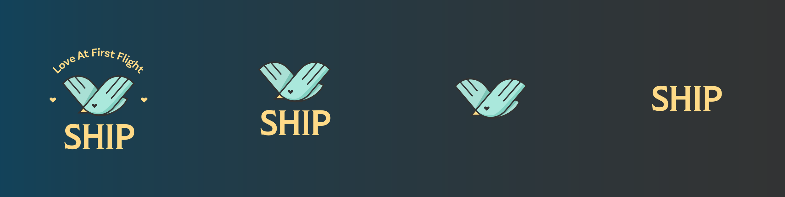
When I was creating the logo we were still toying around with names, so I wrote some of them down and tried to use them as inspiration to combine the main themes of the app. These themes were socializing, love, and travel. To get ideas going, I drew a couple of symbols like hearts, chat bubbles, planes, compasses, etc. At its core the app is meant for dating and creating relationships, so it was important that the heart icon was a main part of the logo design. Keeping the icons simple was also important as the logo would often be used in small forms like on its app icon. In the end I went with the flying bird icon which represented flight and freedom, travel, and love. I also loved the anchor, and after we decided on the name SHIP, I chose to keep it as a part of its branding.
Look & Feel
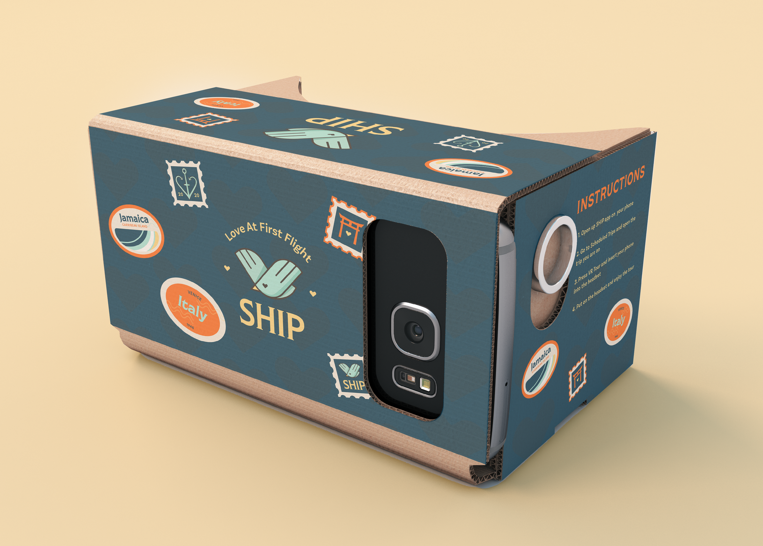
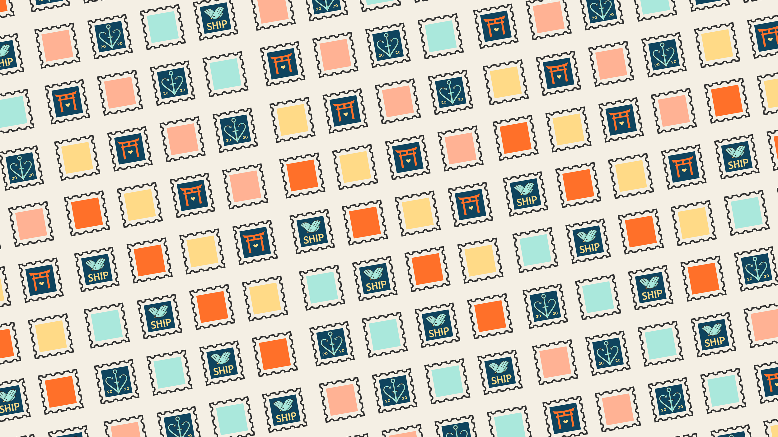
Bringing the idea of travel to the forefront in an exciting way was imperative as most were feeling caged in during the quarantine period. This also allowed me to draw connections to the cuisine that would be paired with each travel ‘destination.’ I wanted bright visuals that keep the user engaged and photography which which gives the user the wanderlust of exploring and traveling through the app. To bring everything full circle I incorporated stamps into the branding which would be delivered with your food or travel experience as stickers which vary by destination and act as an incentive to collect them all. This would keep users coming back for more destination dates with a match they wanted to get to know more or explore with someone new.

Screens
Creating an app that combined dating, travel, food ordering, all in one was no small feat. The process from matching to planning your trip and ordering your food would inevitably take a little while so celebratory screens met our users at major checkpoints. Some of the screens we needed included a login or sign up page, homepage, and travel planning page. Wherever possible, we used warm photos, deep and rich with color to help transport the user and give them a feeling of warmth and sunshine that is lacking when you’re stuck inside. SHIP’s stamps were also incorporated not only as a branding tool, but also to help users express themselves by customizing their profiles. Abiding by standard button and text sizes was a must as we aimed to make the user experience as accessible as possible without compromising our staple bold and rich colors.