To Pimp A Butterfly
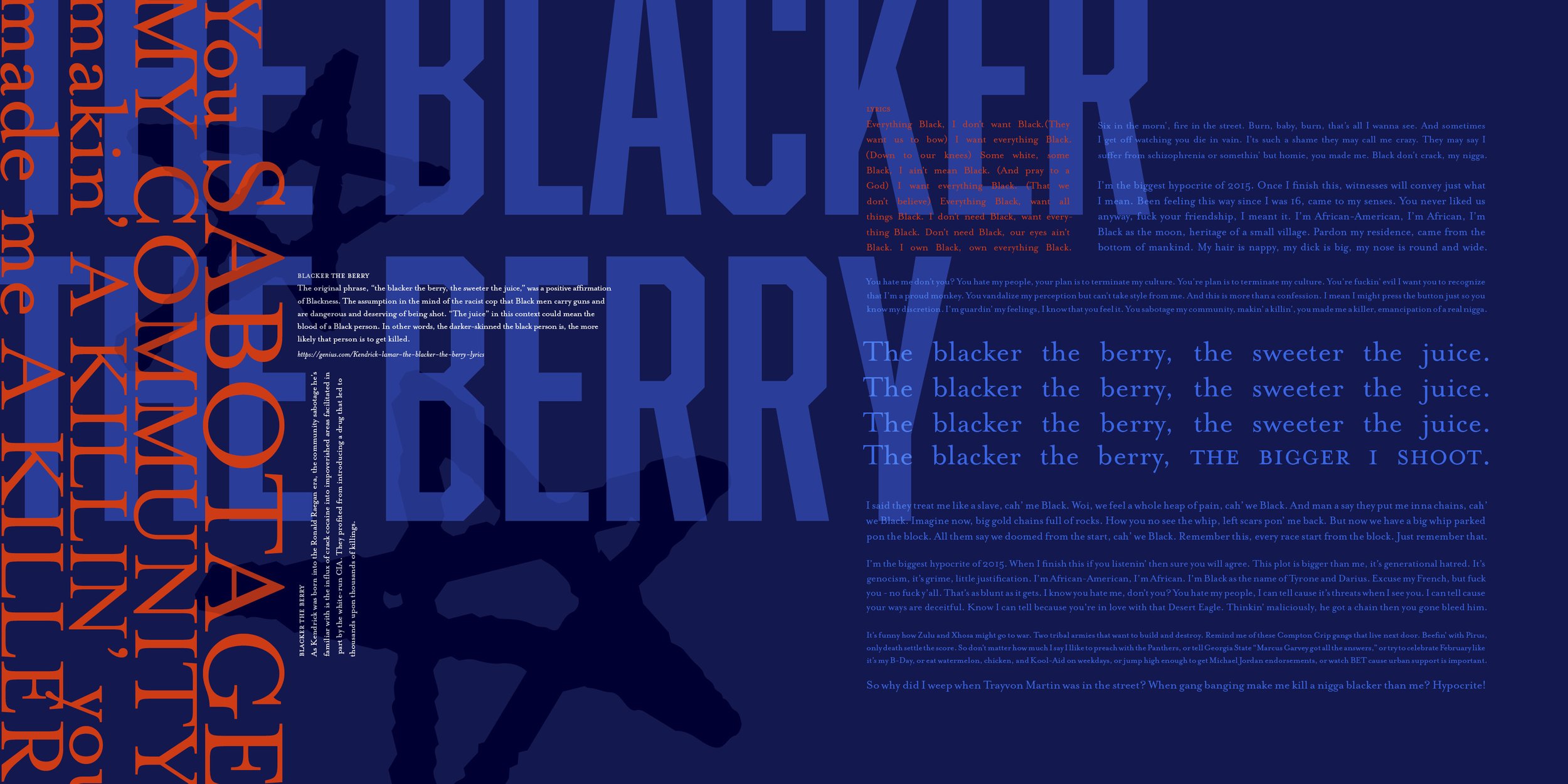
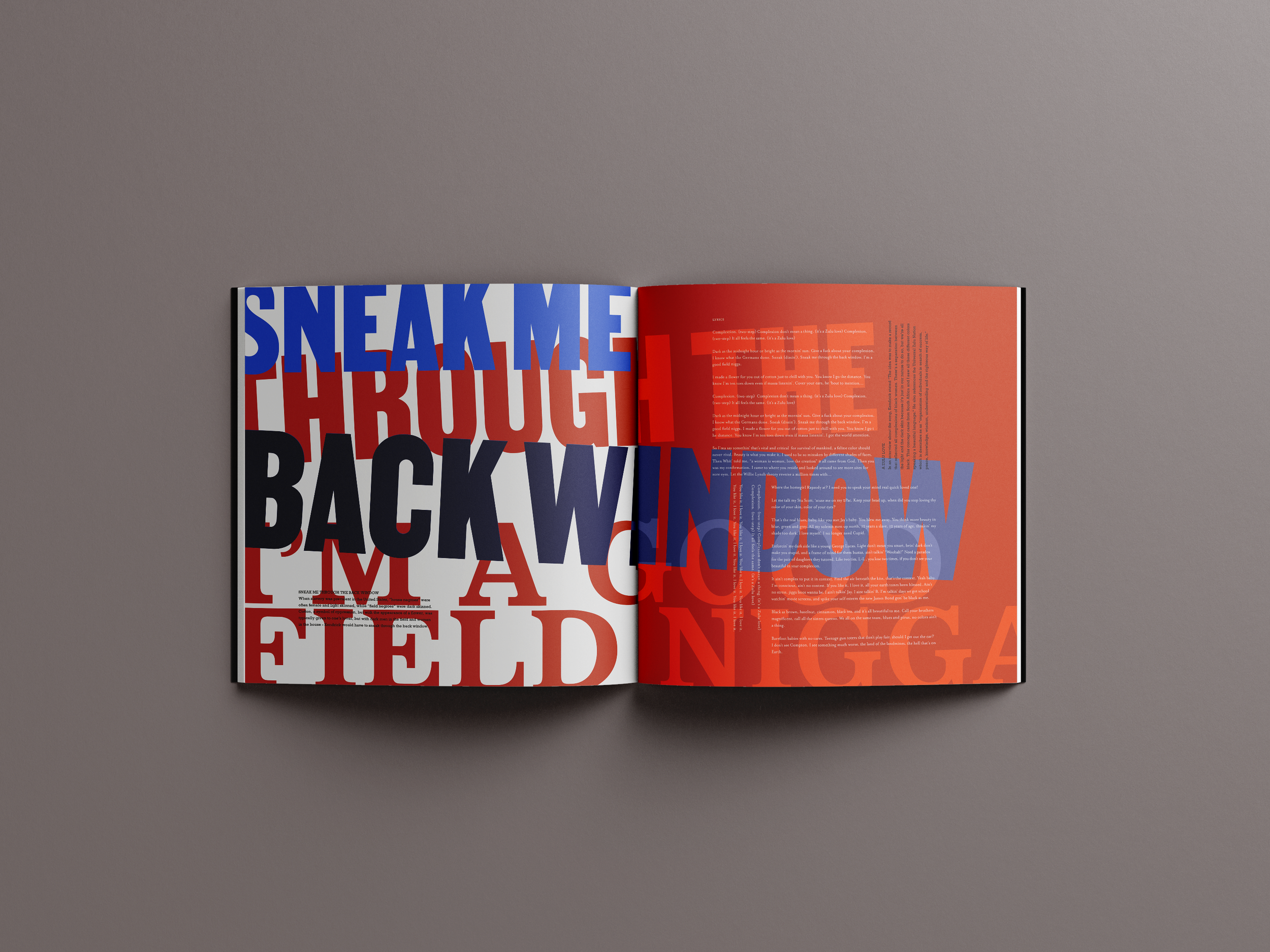
A visual representation of Kendrick Lamar’s album, To Pimp A Butterfly. The album is a critique of American society and the treatment of the Black population throughout the country’s history. The design utilizes color and typography to visually convey the tension you experience when listening to the music.
*Press play and listen along as you take in these visuals.
ART DIRECTORS - Paul Sherriff & Scott Laserow
INSTITUTION - Tyler School of Art and Architecture,
Temple University
c. 2022
MUSIC CATALOG
TYPOGRAPHY
LAYOUT
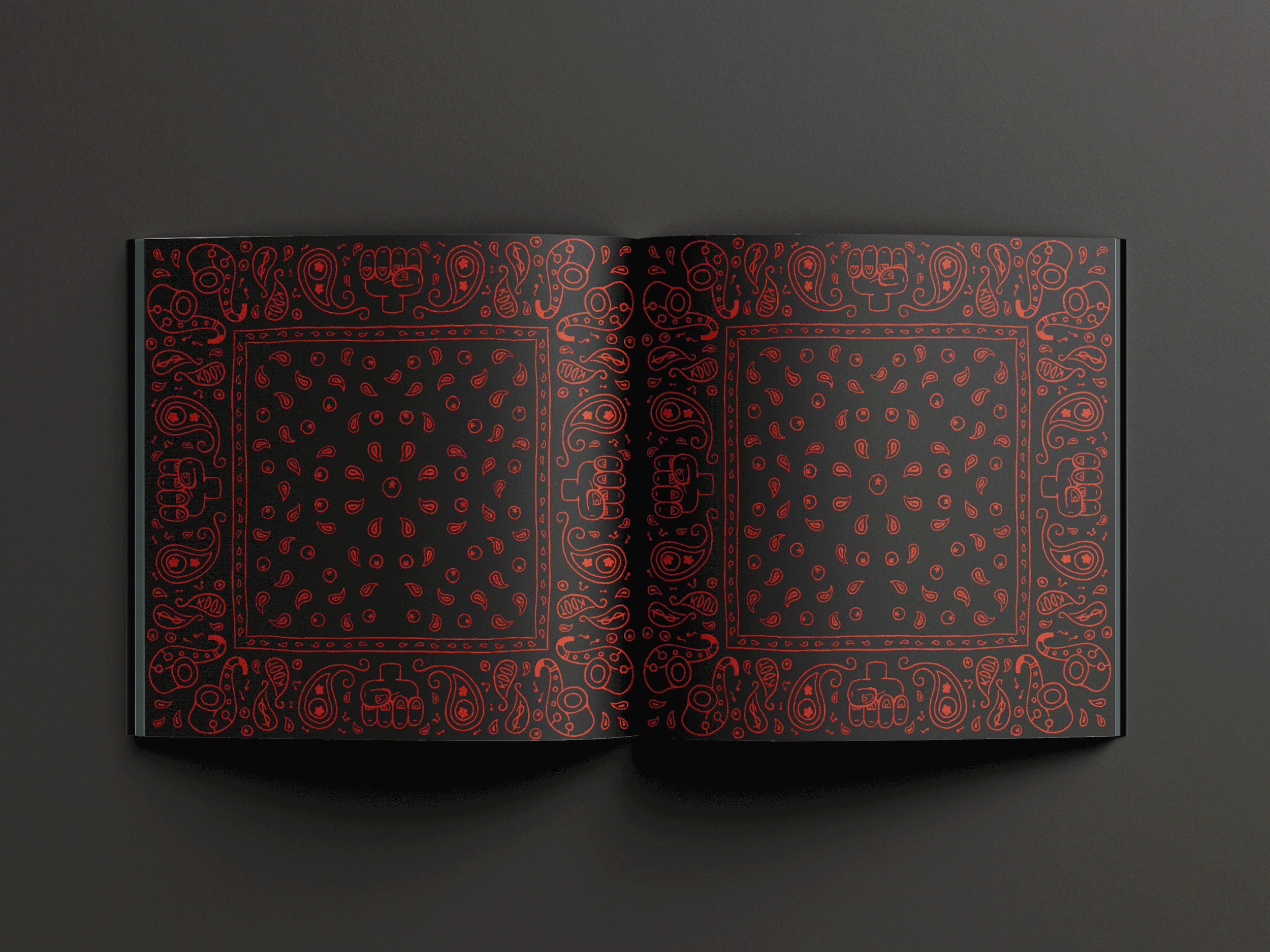


Color
With references to his upbringings in Compton, he speaks on gang culture in this album as well, with the two most prominent gangs being Bloods and Crips. I pulled from those references as well as the themes of the album which led me to using red, white, and blue. These colors notorious for their relationships to the Blood and Crip gangs, are also representative of the American flag. Weaving these colors and other patriotic iconography and symbols was important to aid in the visual layering and subversion of American pride.


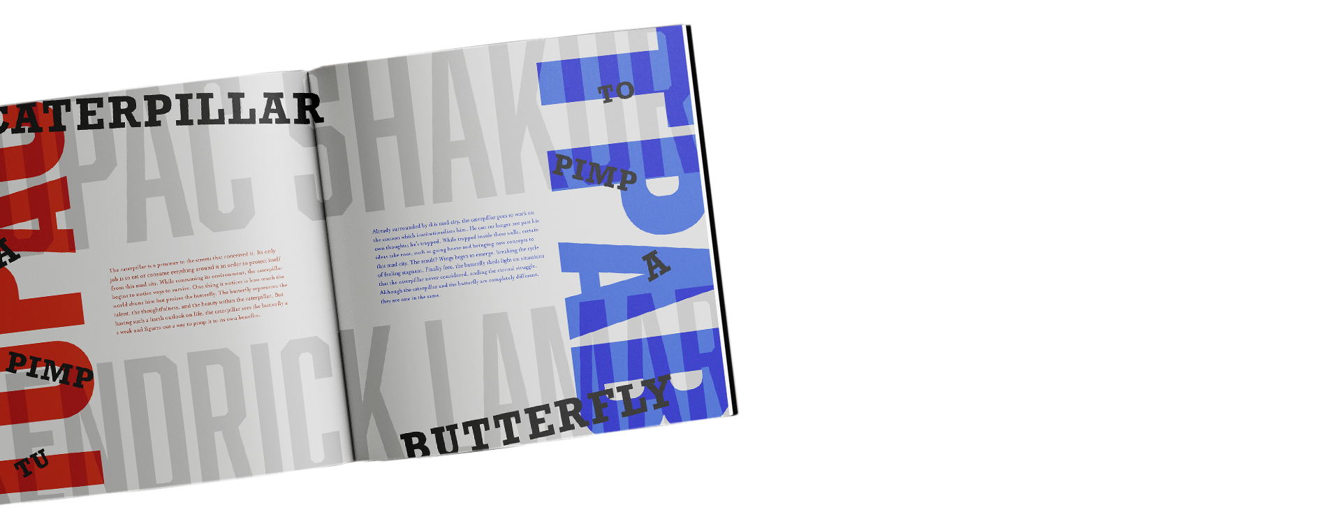

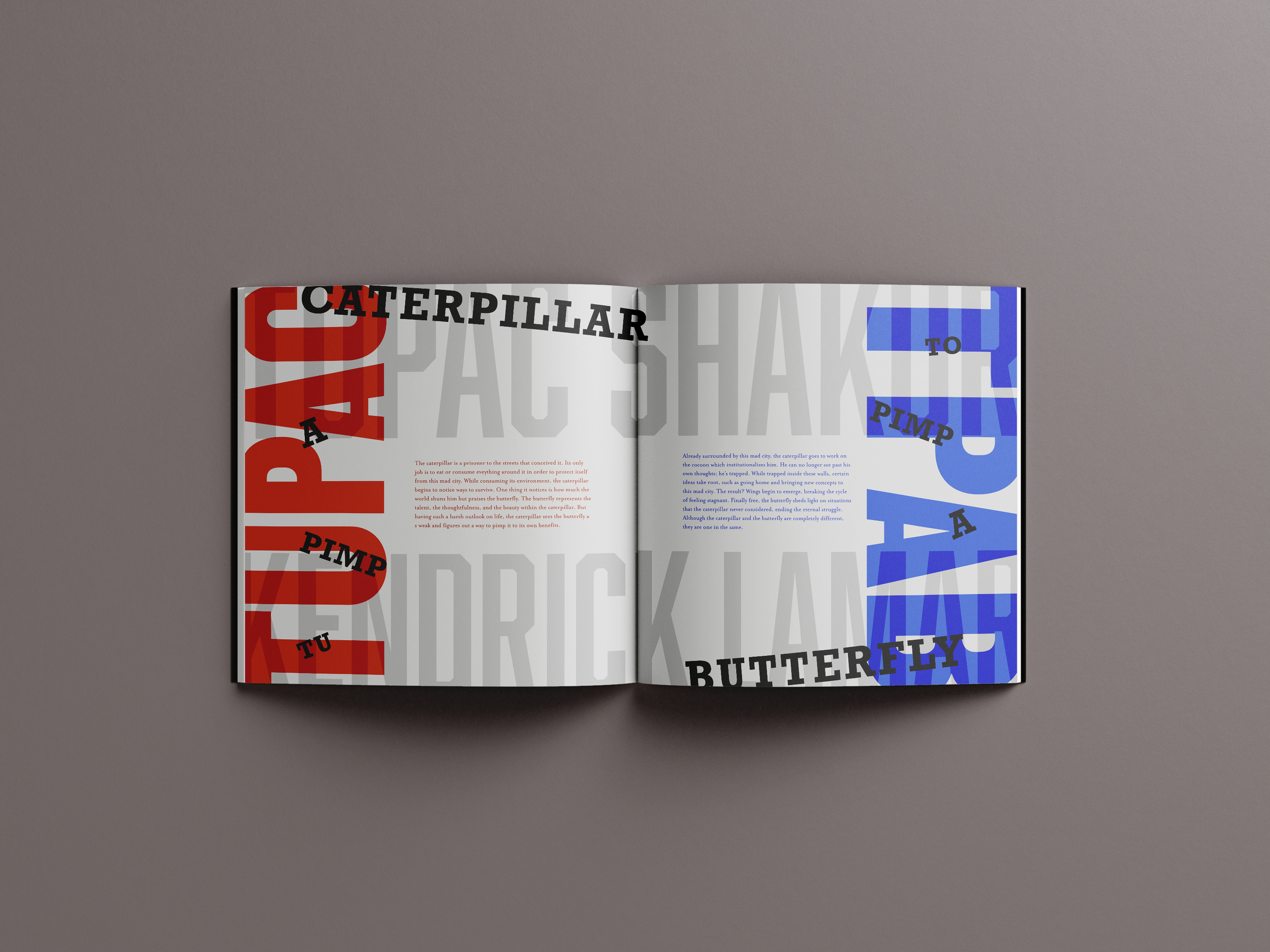
Tupac
Avid Kendrick fans, like myself, will know that the original title of the album was TUPAC, short for ‘Tu Pimp A Caterpillar.’ The acronym pays tribute to the late artist Tupac who heavily inspired this album. On the last track of the album, Mortal Man, Kendrick conducts a mock interview with the late artist, piecing together clips from other interviews to create a seamless back and forth between himself and Kendrick.
To pay homage to the album’s final track, as well as the artist who inspired it, the design features this ‘break’ page which gives context to the album. The page showcases the visual switch from the red to blue while also uniting the two sides.